Quick update: Employee A UI Improvements
Hey everyone! It's been a hot minute since I posted any updates on itch, but that doesn't mean work on Employee A has slowed down at all. Most of my updates get posted on my twitter so if you want the most up-to-date progress, give me a follow there. But for now, I've got a quick progress update on some updates to the game UI that I've made.
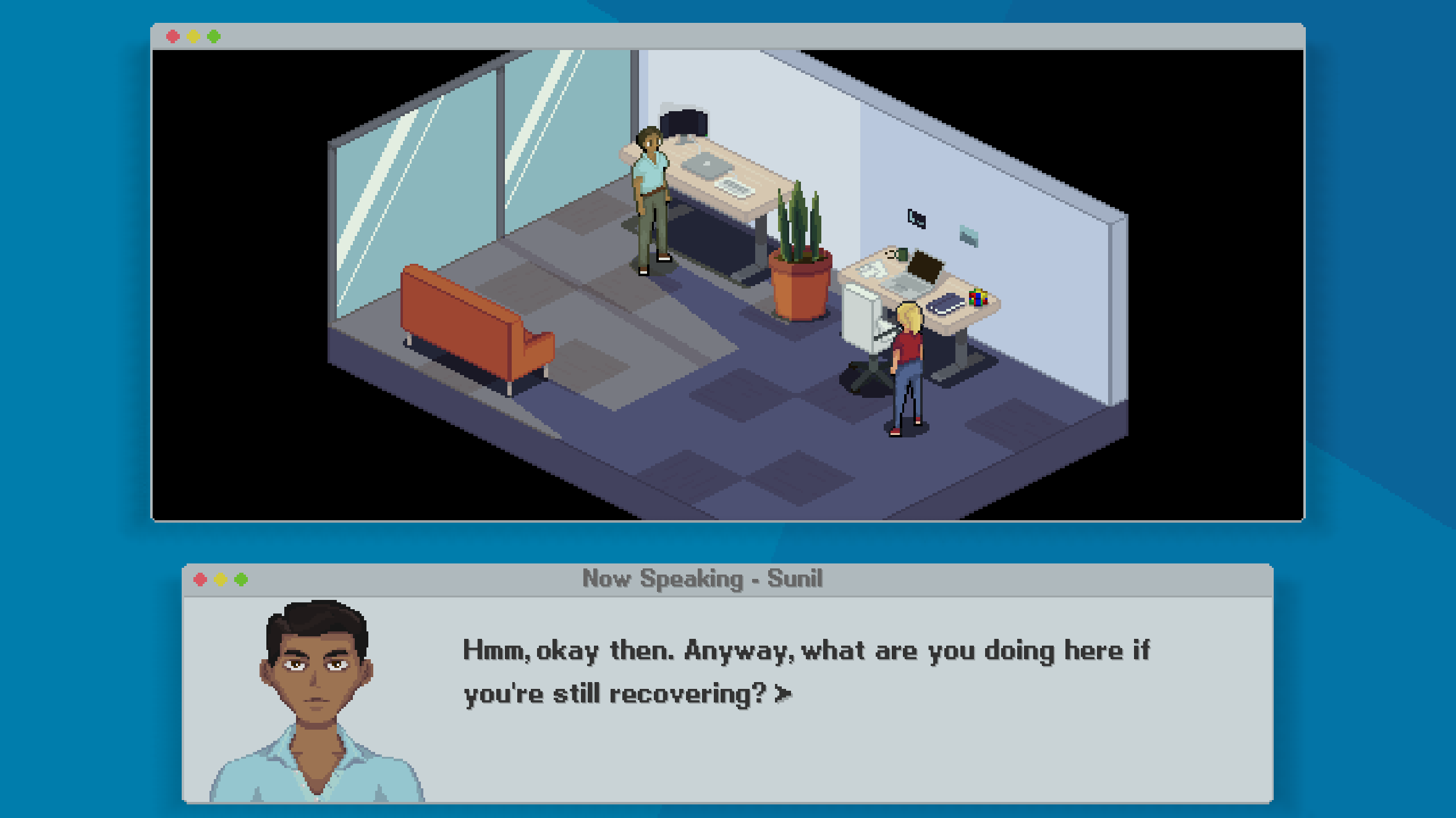
With the introduction of the OSX style application frame, I decided to move buttons and text boxes to a more OSX based style and away from the original iOS style. iOS style buttons will still be used for pop-up menus like text reader, timeline and inventory that are shown in the iPad menu, but the rest will be based on OSX. Let's take a look at a screenshot.
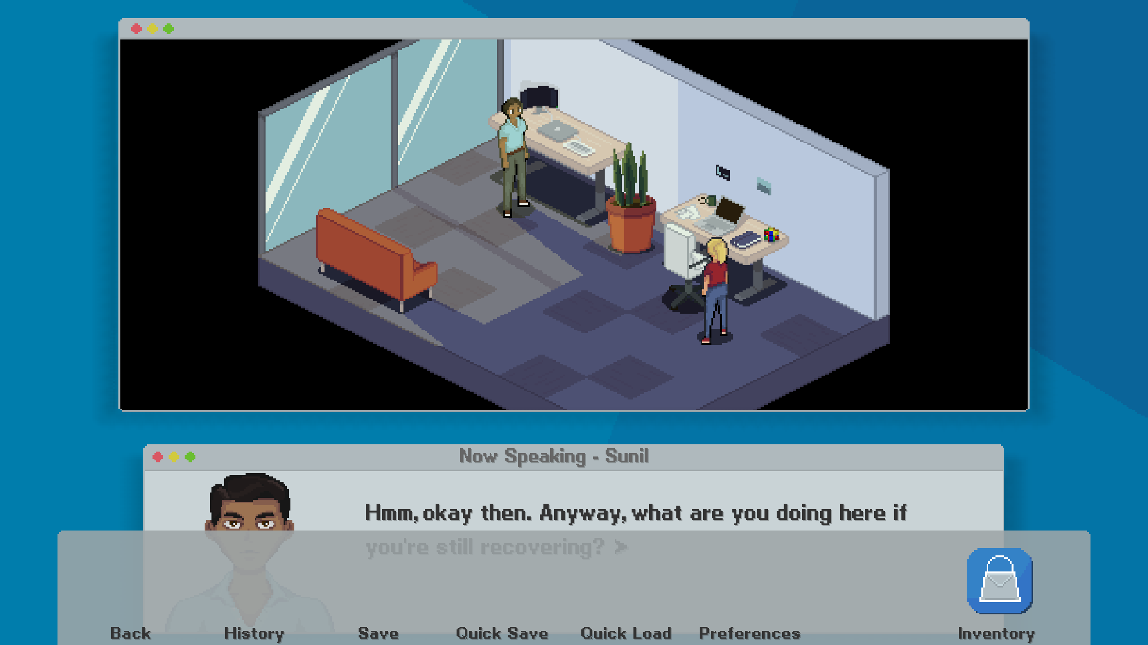
Here, the quick menu on the left and the inventory icon on the right have both gone, and the text box is a new one based on OSX confirmation dialogues. There's also a soft drop shadow behind both windows that's based on the way windows are rendered on Macs. Although the loss of the quick menu may make it seem like there's minimal control from within the game, and no way to access your inventory outside of nighttime, there's a hidden surprise.

Hover over the bottom of the screen and the quick menu will appear. Currently there are no icons for this dock, but in time each will have its own icon.
That's all for today, and don't forget to follow me on Twitter @cross_couloir!
Get Employee A
Employee A
Solve a murder in a toxic workplace
| Status | In development |
| Author | Cross Couloir |
| Genre | Adventure, Visual Novel |
| Tags | antiwork, corporate, Female Protagonist, Isometric, Mental Health, Modern, Mystery, Pixel Art, Point & Click |
More posts
- Employee A development endsNov 28, 2023
- Employee A demo v1.2.1 released!Mar 19, 2022
- Ace Attorney-Style Nonlinear Dialogue in Ren'PyMar 10, 2022
- Employee A demo available now!!Mar 01, 2022
- Employee A Demo drops March 1!Feb 14, 2022
- What Employee A Means to MeFeb 09, 2022
- Charlotte Vents her ProblemsJan 24, 2022
- Colour-changing Images in Ren'PyJan 12, 2022
- New Screenshots and Key Art!Jan 12, 2022
Leave a comment
Log in with itch.io to leave a comment.