Colour-changing Images in Ren'Py
Remember when MacOS had a desktop background that changed from day to night? That was pretty cool.
Employee A has a MacOS inspired UI. The reason I did this is to reflect the world in which the game takes place: real, actual Santa Clara, CA in April of 2018. OSX perfectly encapsulates the aesthetic of the South Bay tech world: sleek, minimalist, functional, and just a little bit generic. But functional minimalism can easily cross over into bland and uninspiring, and that's what the solid blue desktop background, based on OSX 10.4, of older Employee A builds was doing. So I wanted to spice things up.
OSX Inspiration
For inspiration, I took a look at default wallpapers throughout the history of OSX. Every default wallpaper is hosted on this awesome site, in utterly massive resolution, so if you want to relive some Mac nostalgia check it out. Basically, the wallpapers are divided into four eras:
- Early era (Cheetah-Tiger): Blue monochrome with abstract sweeps. Doesn't translate to pixel art very well due to the heavy usage of colour gradients and the relative lack of contrast.
- Space era (Leopard-Mountain Lion): Space backgrounds. These are cool, and pixel art space can look awesome, but it will often have big patches of darkness in it, which I was concerned would create an extremely dark coloured aesthetic overall. Plus, most of the desktop background stays covered throughout the game, so any cool details in the center (like Lion's Andromeda galaxy) would never be visible.
- California era (Mavericks - Catalina): Photos of beautiful locations in California, mostly in the Sierra Nevada. These are beautifully detailed pictures that have the very cool day/night cycle thing going on (starting in Mojave). The problem with these beautifully detailed images is that most of them would be covered up by the windows, and much of the effort on all that drawing would be wasted. But the day/night cycle is really cool.
- 11 era (Big Sur -): Abstract colour gradients with high contrast. These are the most likely to work with the relatively small amount of background that's visible, since the abstract nature means there's no centered subject to the image.
After thinking on all of these for some time, I came up with a plan: a monochrome gradient whose colour changes based on the in-game time of day. In-game time progresses when you complete certain events, and it's tracked by a global state, so it's easy to keep track of.
Matrixcolors Return
Rather than draw separate gradients for each time of day, I was able to implement this process pretty simply using RenPy's `matrixcolor` property. First, I started out with a fully grayscale gradient image.
It's not strictly necessary for that main window cutout to be there, but due to how I split the old background it just kind of ended up that way. This extremely basic undithered gradient will be the base for our desktop background.
To colour this background, I defined a mapping from the current time to a background colour on my global state object. It looks like this:
@property
def timecolor(self):
  tc = {
    9: TintMatrix("#99abcc"),
    10: TintMatrix("#9dc5d4"),
    11: TintMatrix("#c3e5e8"),
    12: TintMatrix("#c2f0e3"),
    13: TintMatrix("#bfe3cf"),
    14: TintMatrix("#c8e6ac"),
    15: TintMatrix("#ede777"),
    16: TintMatrix("#dbb867"),
    17: TintMatrix("#de9259"),
    18: TintMatrix("#e66f4e"),
  }
  return tc[self._time]
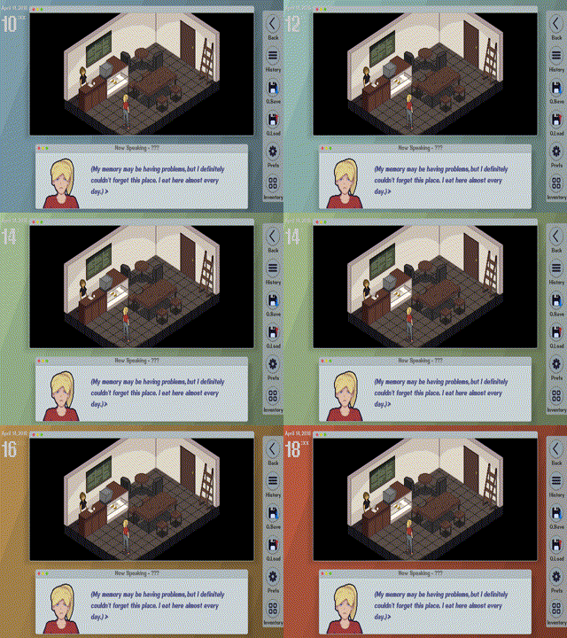
When showing the background, I show it with a transform that contains `matrixcolor gds.timecolor`. This creates a lovely coloured effect that changes over the course of the day, which you can see in the GIF below.

I think this simple hack really elevated the look of the game. I hope you all enjoyed this quick dev discussion!
Get Employee A
Employee A
Solve a murder in a toxic workplace
| Status | In development |
| Author | Cross Couloir |
| Genre | Adventure, Visual Novel |
| Tags | antiwork, corporate, Female Protagonist, Isometric, Mental Health, Modern, Mystery, Pixel Art, Point & Click |
More posts
- Employee A development endsNov 28, 2023
- Employee A demo v1.2.1 released!Mar 19, 2022
- Ace Attorney-Style Nonlinear Dialogue in Ren'PyMar 10, 2022
- Employee A demo available now!!Mar 01, 2022
- Employee A Demo drops March 1!Feb 14, 2022
- What Employee A Means to MeFeb 09, 2022
- Charlotte Vents her ProblemsJan 24, 2022
- New Screenshots and Key Art!Jan 12, 2022
- Quick update: Employee A UI ImprovementsDec 18, 2021
Leave a comment
Log in with itch.io to leave a comment.