Employee A Goes Isometric

This is a relatively short update, but I wanted to address something that some of you might have seen in the screenshots I uploaded.
Two-point perspective is my curse
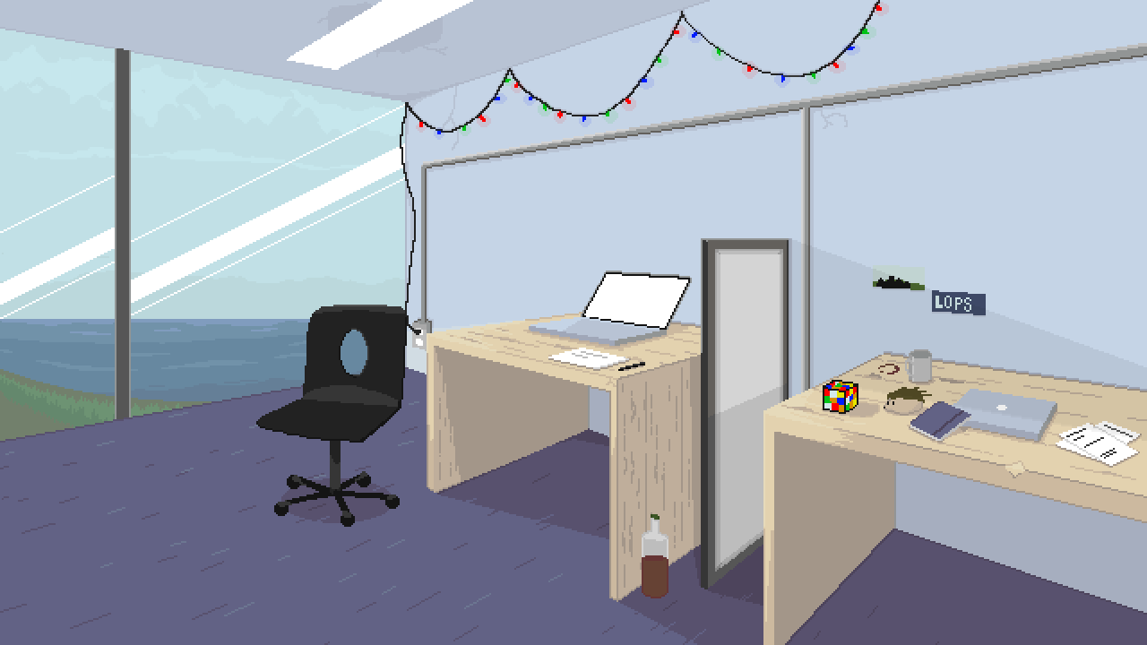
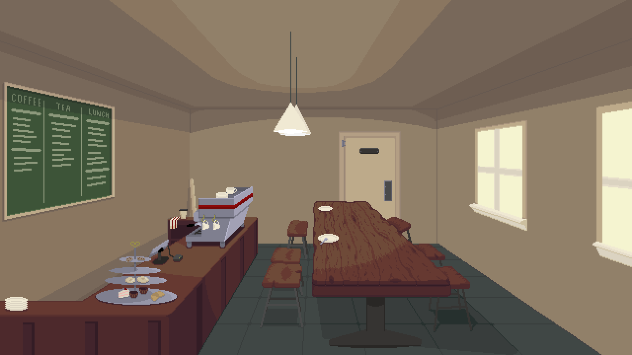
For those of you who have been following Employee A's development for a while, you might remember these background images and the grueling process I went through learning how to draw them.

I'd like to think that I can be honest with myself. These just aren't very well drawn. They're flat with awkward looking shading, questionable composition and many of the smaller details simply came out terrible (look specifically at the table legs in the lower image, or the whiskey bottle in the upper image). Going into Employee A, I'd never drawn anything like these pictures before. As I learned how to draw in perspective, I spent weeks working on each of these images. It's hard to admit to yourself that you can work so hard on something and have it still not turn out good, but sadly, that's what happened.
In August, I (somewhat stupidly) made a commitment that Employee A's gameplay trailer would be available by the end of October. Based on the short screenplay that I wrote, this meant I would need background images for four locations: A's office (upper image), the DataMantle corporate cafe (lower image), the hospital from the game's prologue, and A's apartment. After sketching these out, it was immediately apparent that I wouldn't be able to draw the remaining two backgrounds in time. So I started exploring other options.
I spent some time looking into commissioning backgrounds. I found an artist who was willing to draw the apartment and hospital backgrounds, but I ran into an issue that the images he drew made my own artwork look terrible by comparison. The rates required for these fairly large 640x360 backgrounds made it prohibitively expensive for me to commission him to draw every one of the game's 12 backgrounds. While the images he drew for me will certainly end up in the game, I needed a different solution. Something that would let me draw the backgrounds significantly faster than before.
Changing perspectives
Admittedly, I don't remember where I got this idea. But somehow the idea came to my mind that I could draw the backgrounds in isometric perspective. Obviously this would require me to abandon the office and cafe backgrounds I already drew, but the process was much more formulaic, objects could be moved around easily in a scene, and everything could be built in much smaller sizes. I thought this would speed up my workflow a lot. And I was right!

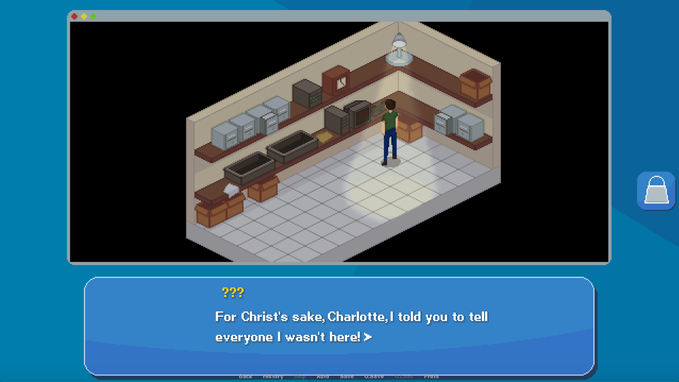
Here's a slightly more up-to-date screenshot featuring the cafe's back office, which is a converted storage closet. This is where A can encounter Jim Li for most of the game.
Right away, the nature of isometric perspective made it easy to populate the room with objects. The trays, boxes, and filing cabinets were simple to draw. Even the more complex lamp and computer keyboard took just a handful of minutes each. In all, the background here took me about 2 days to complete.
The most interesting thing about this image, though, is Jim standing there in front of the computer. The perspective change let me adopt a totally new approach to visual storytelling - one where the characters are visible not just in their side images, but in the context of the scene, moving and interacting. This certainly necessitates additional work in some places: animating the movements of the character sprites, placing the characters in the scene (or "blocking meeples" as my friend and jam partner MintToBe refers to it), adjusting the characters' lighting etc. But I think this gives Employee A a unique flavour that many other adventure games don't have, and it's something I'm really excited about. Make sure to follow me on Twitter @cross_couloir to see regular art updates!
Get Employee A
Employee A
Solve a murder in a toxic workplace
| Status | In development |
| Author | Cross Couloir |
| Genre | Adventure, Visual Novel |
| Tags | antiwork, corporate, Female Protagonist, Isometric, Mental Health, Modern, Mystery, Pixel Art, Point & Click |
More posts
- Employee A development endsNov 28, 2023
- Employee A demo v1.2.1 released!Mar 19, 2022
- Ace Attorney-Style Nonlinear Dialogue in Ren'PyMar 10, 2022
- Employee A demo available now!!Mar 01, 2022
- Employee A Demo drops March 1!Feb 14, 2022
- What Employee A Means to MeFeb 09, 2022
- Charlotte Vents her ProblemsJan 24, 2022
- Colour-changing Images in Ren'PyJan 12, 2022
- New Screenshots and Key Art!Jan 12, 2022
- Quick update: Employee A UI ImprovementsDec 18, 2021
Comments
Log in with itch.io to leave a comment.
Thanks again for doing a write-up on how you do the code implementations. Your Devlogs are always insightful and a joy to read.
Also super interesting to see how the game's look is constantly developing (for example I have always known it for the isometric look and had no idea it was different in the past).